Attack of the Alien Asterisks

Cross Platform Hassles
I’ve been spending an increasing amount of time working on Windows recently, using a virtual XP installation running on an Apple iMac. I’ve had some trouble with key-mappings but by now my fingers have adjusted: the Apple Key is the Windows key, the ALT key is the META key, the HASH key is AWOL. It’s tolerable, especially given my limited enthusiasm for re-configuring.
Surprisingly, I suffer more with the font rendering discrepancies. Or perhaps it’s not so surprising: I write software which, at its most basic, involves shuffling characters around using a text editor until they look right.
I’m not that fussy. Apple is rightly praised for its fonts and rendering but Windows does fine in this area too. What I dislike is having the two styles side by side.
Side by Side
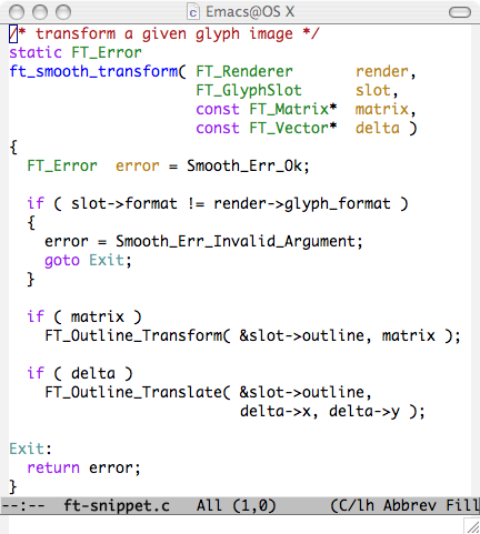
Here’s what I mean. On the Mac, the code snippet looks full-bodied and smooth.
On Windows XP, the same code looks a bit scratchy.

Maybe you prefer the Windows rendering; maybe you wouldn’t just go with the default fixed-width font (Monaco on OS X, Courier New on XP). I suspect it boils down to what you’re used to, which is really the point I’m trying to make: the two approaches to font-rendering don’t coexist comfortably. I wanted them to look more similar.
Clear Type
Clearly getting the OS X text rendering to look Window-sy was a non-starter. So I poked around in the XP display properties.
Display Properties → Appearance → Effects…
I then checked the ClearType option to “smooth the edges of screen fonts”, and this is what I got.

An improvement, I think, and certainly closer to the Apple rendering. (Apparently ClearType is on by default for Windows Vista, and I recognise it from recent versions Internet Explorer.)
The asterisks look a bit odd though. Here’s a close up of a field/flock/fleet of them.
Scary!