Distorted Software

Helicopter View
Recently I’ve been helping scope a project to develop a new Product. In an Agile world big design up front may be frowned-upon, but commercial reality requires some idea of costs from the outset. You need to plan, to size up the job. You must somehow answer the question: What will the software for this Product look like?

I don’t mean “What does the UI look like?” any more than I mean “Will it have a funky yellow chassis?” or even “What will source tree look like?”.
I’m talking about something less easy to visualise:
- what will the main components be?
- how do they connect?
- how big are they?
So, what exactly does a database look like? How about a web server? Or a message queue? A state machine?
Quick pictures
I have my own shorthand for depicting all of these things. I’m aware of more formal visual languages which aim to define software designs for programmers, much as circuit diagrams do for electricians, but I’ve resisted learning these languages. For me, the act of making the drawing is a large part of what the drawing communicates. A frozen snapshot only tells half the story.

For our planning exercise we needed a picture of the software. Something simple, archetypal even, like the Pipeline or the Onion, would have been nice, but a few hours at the whiteboard left us looking at something more typical, the Application.

As a basis for ongoing discussion and design this picture works. It’s expressive and flexible, and, by uniting my favourite drawing tools (pencil and paper/white board and marker) with my favourite digital imaging tools (a scanner/digital camera) and my favourite project management tool (a wiki), we can create a visual record of the evolving design.
For planning purposes, though, such pictures can be dangerously misleading. If you want to know how many people you’ll need and how long it will take them, you’d be inclined to focus on the blocks — the closed shapes on the picture. Won’t the total effort just be the total area of all the blocks?
No! It won’t.
Dependencies
For one thing, there’s the issue of dependencies: the UI depends on the Engine, which in turns depends on the Database, which needs a License Key, requiring a Signature, waiting on a Person, who’s on holiday etc. At this point the Project Manager steps in and turns our simple diagram into an ugly Gantt chart.
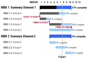
I consider a Gantt chart a poor way to visualise a project. It’s brittle, complicated and expensive to maintain. Driving the associated planning software seems a black art. The only good thing about Gantt charts is a side-effect: generating one requires a bit of thought. You have to think how you’ll transform your Application design into a working Product. Maybe then, just maybe, you’ll realise the important tasks — the biggest horizontal bars on the chart — do not correspond directly to the block shapes on the picture.
Lines and Arrows
Those slender lines and arrows on our Application diagram take time. The bulk of the work will not be developing the boxes, bubbles and circles; connecting them up might take as long again, or, more likely, ten times as long again. There are interfaces to design, protocols to code up, error conditions to handle.
Bugs in individual components are, by definition, easy to isolate, making them straightforward to squash. Combining these same components makes the defects harder to pin-down, let alone fix. It’s almost impossible to estimate the time required to fix integration issues.
The most dangerous mistake of all occurs when we already have some of the components, ready to pull down from the shelf. The argument goes: we have the Database, we have the Server, we can adapt the Engine, bolt on a new Interface, so the Product is nothing more than a software plumbing task. How long can it take?
Distorted pictures
I suggest the problem stems, in part, from using a design picture too literally1 as a planning picture. We need a representation which distorts our original picture to properly emphasise interfaces, connections, protocols, integration.

The London Underground map is one famous visual distortion. When you want to travel from, say, South Kensington to Mornington Crescent, you need to know which train to take, for how many stops, then which train to change to, and so on. That is: you care about topology rather than geography, and the tube map gets the emphasis right. A street map doesn’t help much and a visually accurate satellite photo would be almost useless.

Sensory Homunculus
Another famous distortion, the sensory homunculus, appears at the top of this page and in miniature here. The image is hosted by the Natural History Museum’s online picture library, with the explanation:
This model shows what a man’s body would look like if each part grew in proportion to the area of the cortex of the brain concerned with its sensory perception.
Or, as Wikipedia puts it:
Well known in the field of neurology, this is also commonly called ‘the little man inside the brain.’
Application in Proportion
So, what would our Application diagram look like if each component grew in proportion to the time taken to develop it? Maybe something like this:

The sensory homunculus is striking because we’re all so highly attuned to what people really look like. The figure is instantly recognisable as human but the proportions diverge so radically from what we expect — from what we know — that we’re forced to look again. A simple image constructed by applying a logical rule can change the way we look at ourselves.
Having no such feelings for software, surely we can change our pictures to suit?
I don’t pretend this final picture, with its fat orange arrows, makes a great planning aid, but perhaps it may help us look afresh at our estimates.
There are techniques to reduce the overheads and risks I discuss in this article, but I’ll save them for another time. Even if careful planning and execution can shrink the arrows down to a more comfortable size, I still maintain connections take longer than blocks. I would be interested to know of any software architecture diagrams which show this clearly.
1 Literally means “as read”. Its root meaning has to do with words and text. Is there an equivalent for “as seen”?